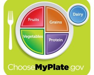
At Bon Appétit, we’ve let the powerful union of simplicity, taste, and nutrition guide our menus for a long time. So we were pleased to see that yesterday the U.S. Department of Agriculture replaced its complicated Food Guide Pyramid with a new, elegantly simple “My Plate” graphic. This new icon boils down what many consumers felt were complicated scientific messages into a clear snapshot of what your dinner plate should look like for good nutrition: more than half your plate should be filled with vegetables and fruit, and the other half with grains (mostly whole) and protein.
USDA
+ Blog Categories